Tuesday, October 26, 2010
Even the dead like good typography
 Pretty cool huh? Well I would say if I were into headstones that I would like one of these. Here's the link check it out.
Sunday, October 24, 2010
All hail After effects!
I'll start posting some links in this as I find some tutorials on after effects.

Here is the first and it has about 40 ranging from adding animation to video to flaming chrome letters and other super cool odds and ends.
How to over simplify a logo.

Okay it's four dots and a small grey dot and this is a reductive logo. I haven't checked but I thing it's for Hulu based on the color. Check out the many many creations like this here.
Friday, October 15, 2010
This is what happens when you stare at type too long.

Maybe it shouldn't bother me that the g is backwards but it does it really really does and I have searched for 5 minutes on the site for a way to contact them to correct the error but have given up. Is this what my future hold for me? Andrea how often does this happen to you or have you just gotten to the point where you walk away?
Tuesday, October 12, 2010
Setting the record straight or gay


Sunday, October 10, 2010
The end is near!!!
Come on and take this survey I'm only halfway through I can guarantee I have taken yours. The kitten is still on the table.
Sometimes it's okay to cheat

Saturday, October 9, 2010
National Ignition Facility OMFG!!

Oh and here is the link to the NIF website you know the link is good when the URL begins with lasers.
Getting some good things

So I'm sitting up here at Henry's tucked away in the corner working away at this poster project and found out the legs taper very slighty with caps A in Century Schoolbook. But it did get me thinking about composition and so now I've got some things going on that are looking pretty pretty good. Hope all is well in the world of Typography for the rest of you.
Found this great post on I Love Typography about type terminology and history. Wish I had found this sooner
This is why: Herman Miller
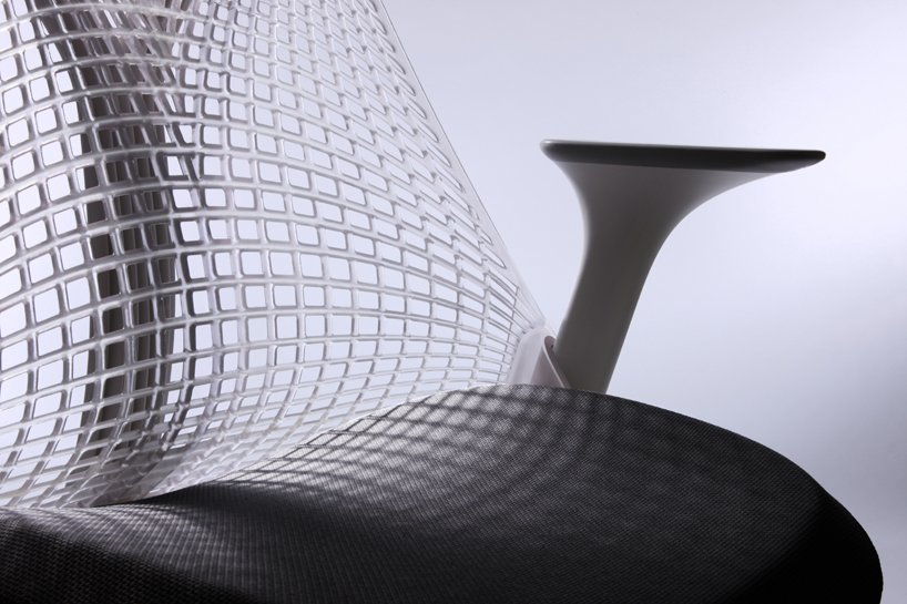 Herman miller has for decades been one of the cornerstones of American Design and a pioneer in industrial design and applications f new materials. I can't say I would want to design for them but is I was able to design like they do I would be a little giddy. The picture above is of the SAYL chair. A chair utilizing a urethane web that actually varies in density through the matrix and is based on the Golden Gate bridge. This is the height of cool on so many levels and really begs the question how much is design for function and how much was design for aesthetic? Maybe the real point is that you can't really tell at first and I think in that lies the heart of good design and can be applied to all forms of design.
This was designed by Yevs Behar and with out a doubt he will be known in the furture as one of the key Industrial Designers of our time. Check out his fuseproject and be blown away. And here is a great article about the development of the SAYL chair.
Wednesday, October 6, 2010
Instead of home work
And evening with CSS and round corners and alignments all in dreamweaver.
Here is a cheat sheet for Dreamweaver
Tuesday, October 5, 2010
Please tell me about your colors.
Just run through these questions go with your gut and everything will be alright. Don't forget to click on the finish survey at the bottom of the scroll box.
Monday, October 4, 2010
Here I am working
Online psych tests make you feel crazy. I'm looking forward to a part time schedule next semester instead of filling up on classes I don't need. Women are a distraction, a wonderful distraction.
Video for you
Something just struck me aout this video. The visual of all those GI Joes floating from the top of the Hyatt in KC just looked good. From Photoshopisland and it seems they might be based out of KC and they offer free tutorials and downloads on their website as well as a paid membership.
What
Need 5 good things I can survey the class for to begin making info graphics. So I figure it's going to be a class filled with people wanting to ask about sleep and drinking and computer use. Those were my first thoughts and I've overheard more than a few people say the same thing. So I'm looking for something that has some depth and could offer a chance for some great visuals.
1. Marijuana use: Looking at different aspects such as frequency of use vs how often they purchase or how much they use now vs in high school. I think there is a large set of imagery we already associate it could be a fun challenge to try and go away from those and try something new.
2. Color: here I could have many options from what your favorite and least favorite are out of a sample scale to what color reminds you of what emotion and comparing the results offering many options and a colorful palette.
3. Death match: Got this idea when talking to my friend Jonathan, a series of vs situations like Ninja and Zombie. This is all just fun and a chance to doodle some fun things. Nothing here is very serious at all.
4. Paid vs Pirate: software use and how much is pirated, this could be a stand alone or juxtaposed against data on media. Many obvious images and graphics but they also seem like great starting points.
5. Social Whore: Figure usages stats for various social media including txt messaging, do you message more than one person a lot. are you a follower or do you lead the group sort of thing. Maybe I could also include a 1 to 10 scale on satisfaction with the media type.
So those are the first 5 maybe I can come up with some more.
Comparing type
Fond this cool site that lets you compare up to 3 typefaces at once. Could be useful.
Sunday, October 3, 2010
Typographic Classification
So I just finished entering most of it and thanks to a flakey internet connection it is all lost. I'm calling this one a night and I'll recompile it in the morning. Expect to see multiple updates of this post just so I don't loose all my data. So maybe a few people in class would like to find some free fonts try Dafont
_ Transitional- Sharper seriffing and a stronger vertical than the old style these fonts were a bridge used in the transition to copper and wood. Baskerville is an example of this class.
_ Modern- Were much more dynamic than previous generations combining slab serifs and the use of different line stroke weights. Bodoni is an example of the high contrast font class.
_ Slab Serif- A type class used in advertising in the late 19th and early 20th key characteristics are the strong square ended serifs. Fonts in this class can range from dense to light but most maintain a high readability even at distance and have a strong presence on the page.
_ Sans Serif- Also refereed to as grotesk these fonts were developed for the press and were influenced by the bauhaus movement in Germany. They forgo seriffing for a much cleaner over all effect. This is by far the most commonly used font class currently due to the high legibility and relatively benign nature. Helvetica and Univers are the most common examples of the class.
_ Script- This font class emulates the handwritten word and has a lower contrast and light presence on the page. The stroke usually has a dynamic width and is closest to actual calligraphy of all classes.
_ Blackletter- Highly ornamental based on the work of scribes for the illuminated manuscripts this font if highly dynamic in it's use of stroke weight and ornamentation of the individual letters. The overall contrast on the page is pretty low though. Old English is an example of the class as well as the type face used for the mast head of the New York Times
_ Grunge- Distressed typefaces featuring a worn and abused look. The use of these is more common in screen printing and posters where the increased size offers better legibility. 28 Days Later is one of my favorites from this class.
_ Monospaced- these fonts were developed first for the typewriter and then used on computers and are still used in terminal applications. Each character uses the same amount of space. These fonts therefore are great for technical applications but do not offer the same variation of color on the page that a non monotype would offer. You can find many monospace variation of the other font classes.
_ Undeclared- is a catch all for those fonts that escape they previous categories. And all my searches have given me nothing other than that short answer.
_ Old Style- typefaces from the 14th and 15th century rooted in the renaissance, they from have a low level of contrast and a friendly appearance. Their emulation of calligraphy hurts the print quality of this class vs other fonts designed for print. Garamond would be an example of this class with rounded serifs that are bracketed.
_ Transitional- Sharper seriffing and a stronger vertical than the old style these fonts were a bridge used in the transition to copper and wood. Baskerville is an example of this class.
_ Modern- Were much more dynamic than previous generations combining slab serifs and the use of different line stroke weights. Bodoni is an example of the high contrast font class.
_ Slab Serif- A type class used in advertising in the late 19th and early 20th key characteristics are the strong square ended serifs. Fonts in this class can range from dense to light but most maintain a high readability even at distance and have a strong presence on the page.
_ Sans Serif- Also refereed to as grotesk these fonts were developed for the press and were influenced by the bauhaus movement in Germany. They forgo seriffing for a much cleaner over all effect. This is by far the most commonly used font class currently due to the high legibility and relatively benign nature. Helvetica and Univers are the most common examples of the class.
_ Script- This font class emulates the handwritten word and has a lower contrast and light presence on the page. The stroke usually has a dynamic width and is closest to actual calligraphy of all classes.
_ Blackletter- Highly ornamental based on the work of scribes for the illuminated manuscripts this font if highly dynamic in it's use of stroke weight and ornamentation of the individual letters. The overall contrast on the page is pretty low though. Old English is an example of the class as well as the type face used for the mast head of the New York Times
_ Grunge- Distressed typefaces featuring a worn and abused look. The use of these is more common in screen printing and posters where the increased size offers better legibility. 28 Days Later is one of my favorites from this class.
Here is a link to a list of this designers top 60.
_ Monospaced- these fonts were developed first for the typewriter and then used on computers and are still used in terminal applications. Each character uses the same amount of space. These fonts therefore are great for technical applications but do not offer the same variation of color on the page that a non monotype would offer. You can find many monospace variation of the other font classes.
_ Undeclared- is a catch all for those fonts that escape they previous categories. And all my searches have given me nothing other than that short answer.
There are of course many subsets in each class depending on how far you want to go into this.
Behance.net Update
Subscribe to:
Posts (Atom)