Showing posts with label VISC 202. Show all posts

Saturday, January 1, 2011

First sketches.


So here are the first sketches of the process book for the semester I'm looking to have it post bound and I'm going to begin doing some digital mock ups and make a dummy or two. So I began with an outline of what needs to be covered allotting a page count to each section and working out how many total pages I would need. I went on and sketched out a dummy to work out the spreads and then made an actual dummy of one section with other pages like the cover page and title and table of contents.

I see this as a chance to explore some ideas I cam up with diring the semester but wasn't able to execute because of time. I used the idea of a pull out or centerfold style spread on my second process book in VISC 204 and I have made a pop up book in my drawing for design class. So I was thinking of an exploration in those directions as long at it would add to the book and wouldn't just be fancy crap for no reason.

I'm also looking for a design style or aesthetic concept for the book so I just threw down a few quick ideas and let this simmer in my head these last few days. Tonight I plan on further exploration of these concepts and research into other options. I really want to be able to make one section and replicate it for each project and then only do tweaks and modifications to enhance the visual hierarchy. I do know one of my objectives is a simple and compact design.

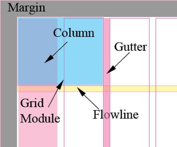
When looking at size solutions a landscape 8.5x11 seems to be the best compromise reducing the footprint of the gutter and increasing the total printable area. I am open to other sizes and formats, but I think from my experience this semester this first option will prove to be the best fiscal/design compromise.

Thursday, December 16, 2010

Process Process Process

I am in the midst of a gigantic series of upload to Behance. As pretty as the site is it is still very cumbersome as I found out today when it showed a project I should have published a few weeks ago still waiting for me to hit the publish button and that was all it needed. These works will be updated over the next few days to include better descriptions and some of my process work.
As for my DVD cases, I'm shooting them this weekend and uploading the shots as well, the flats just don't do them justice. More updates to come in the next few weeks. As well as some of the work I've been wanting to do but haven't had the time to. And of course I'm going through and reworking many of my pieces with the guidance I have received through the final crits.

My only concern now is fixing my credit score so I can get a loan to pay for the classes that are keeping me from enrolling in the next semester, so most see this as a break I'll probably be working just as much over the next 4 weeks, if not more so. Funny it will be faster for me to pay these fraudulent bills then it will be to dispute them.

UPDATE: So I was able to get the first round of my sketches up on behance and I have the beginins of my things for the Badlands project started. Just need to compile all the bits and bobs I made for both into a web friendly format, a task easier said than done.

Sunday, November 21, 2010

Yves Behar


If you'd like to see that the world will look like in the future crack open Yves Behar's head open.
His work in industrial design is dynamic and clean with out putting you to sleep. Some of his designs are better than good and you know this when you look at his work and question if the products haven't already looked like that or you ask why don't they look like that. His products range from packing to affordable eyewear for children in undeveloped countries.

Responsible, Global, Diverse, Simple, Dynamic, Modern, Classic, Smooth

Dave Brubeck


Dave Brubeck is an American Pianist and Composer, known for his work in Jazz. His work is sleek there isn't much more that needs to be said about the visuals that his work inspires. Cool people listen to his work, cool people that wear berets and dark glasses in low lite rooms. During his prolific career his group the Dave Brubeck Quartet were releasing up to four albums a year. He is best know for being out of traditional time. The piece you are listening to (Blue a la Rondo Turk) is in 9/8 time. His group has the best selling Jazz album of all time and helped bring a truly american form of art into the mainstream.

Cool, Quick, Hop, Dance, Tap, Toot, Swingin, Sleek, Rich

Sergio Leone


Sergio Leone is nown known to be one of the best directors of the western genre and a master of the wide frame and sound. Early on he was known as a thief or not known at all. In his first movie A Fist Full of Dollars he blatently ripped off Kirosawa's film Yojimbo. Going with the western genre instead of the feudal Japan in Yojimbo. Leone made use of lighting and sound and interesting people to flesh out his movies. If you were to eliminate on of these it would cease to be a Leone film.


On Once Upon a Time in the West a grip climbed up a two story wind mill to oil it only to have Leone yell at him to leave it the way it was even though there was protest that is made too much noise. That element played into the pacing in the opening scene. Often he would used sound in place of dialog and there is a conservation od dialog though out his movies.His career was reletivly short but has influenced many of our current directors and genres.

Gritty, Squeel, Whine, Guns, Vistas, Close up, Old West, Criminals, Conflict


Wayne Thiebaud

Wayne Thiebaud has for many years re-created many of the things that people with a sweet tooth crave. His work is best viewed in person with only one of his pieces in the room. Some of his best known work has been of pastries, cakes doughnuts and pies. His style is rich and sculptural. There is a gestalt effect when viewing his work the colors aren't what you'd expect to be used when you inspect his work closer. Thiebauds pallet is bold and applied like you would expect a cake decorator to do, thick, super thick.

Aside from his food he is known for still life and portraiture where he uses the same technique. In a series of pieces featuring his wife some criticized how un idealized he had portrayed his wife. He often exaggerates contrast with neon greens mixed in with purples alone a thick black line. In his work you can find the execution of a complete color theory class.

Thick, Rich, Eatable, Bold, Brushwork, Colorful, Gestalt, Pop

David LaChapelle


Nearing 30 years of publishes work LaChappelle has pushed photo media and the viewers ability to take it all in to the brink. His work is often high in contrast and rich in visual texture. Looking at his work you can see a hyper active visual style that crams the frame full of visual information and sub text. His portraiture is renowned and sexually charged to the point of desensitizing the viewer to it as well.

LaChapelle has for many years been working in music videos and commercial advertising giving us a candy land world with dramatic lighting and rich settings. It can be said there are two worlds when you look at his work, the one you physically occupy and then the places where your mind now resides. Life looks so much more dull after looking though one of his books.


Sleek, Shiny, Bright, Loud, Chaos, Pop, Surreal, Beauty, Sexual, Eye Candy

Monday, November 8, 2010

Weather Animated

Come on down and take a look at my latest edition to Behance, my weather animated video. Full information is listed with it.

Sunday, October 24, 2010

All hail After effects!


I'll start posting some links in this as I find some tutorials on after effects.


Here is the first and it has about 40 ranging from adding animation to video to flaming chrome letters and other super cool odds and ends.

Friday, October 15, 2010

This is what happens when you stare at type too long.


Maybe it shouldn't bother me that the g is backwards but it does it really really does and I have searched for 5 minutes on the site for a way to contact them to correct the error but have given up. Is this what my future hold for me? Andrea how often does this happen to you or have you just gotten to the point where you walk away?

Tuesday, October 12, 2010

Sunday, October 10, 2010

Sometimes it's okay to cheat


Saw a class e-mail about keyboard shortcuts and remebered tha
Fordummies had cheat sheets so her it the link for the CS5 keyboard shortcuts. And further searches of the site will yeail cheat sheets for many other programs and most of the keyboard shortcuts in cs4 are the same in cs5. Good luck and happy designing. And don't let Joey Greco catch you.

Saturday, October 9, 2010

Getting some good things


So I'm sitting up here at Henry's tucked away in the corner working away at this poster project and found out the legs taper very slighty with caps A in Century Schoolbook. But it did get me thinking about composition and so now I've got some things going on that are looking pretty pretty good. Hope all is well in the world of Typography for the rest of you.


Found this great post on I Love Typography about type terminology and history. Wish I had found this sooner

Monday, October 4, 2010

Comparing type

Fond this cool site that lets you compare up to 3 typefaces at once. Could be useful.

Sunday, October 3, 2010

Behance.net Update

Finals for both visc202 and 204 are up on Behance. Oh and Behance could I get a batch uploader of simple interface, give flickr and picasa a look and you'll find some good ideas.

Friday, September 10, 2010

Wellcome to my Univers *in progress*

Adrian Frutiger was for in Switzerland in 1928. He had and early fascination with script fonts and did not want to use cursive in school. It was from this issue he was sugested to go into printing and began cutting lead in Interlakin for three years.

His wood engraved illustrations caught the eye of Charles Peignot, of the Paris foundry Deberny Et Peignot. Here he began to make the transition of type from lead to film. "The task of adapting the typefaces of the old masters from relief type to flat film was my best school." and at this Frutiger did excel. His first font were serifed President slanted and released in 1954. But is was of his own idea where to take the Grotesk Sanserif fonts forward.

Here is a great pdf on Mr. Frutiger


What makes Univers “unique”, what is the Univers grid?

Catching up 8-25 Type and how to measure it.

Alphabet Variation
  • Type weight - Type weight is a product of the stroke(width)
  • Type width - It is the width of the type from side to side
  • Type style - are variations on a font and still in the same font family, ie. black, ultra and old style
Measuring Type
  • How is type measured in inches, mm, points or picas
  • Point - is the smallest form of typographical measurement 1/12p or 1/72"
  • Pica - a typographical unit of measurment, 1/6" or 1/76'
  • How many points in an inch? - 72
  • If a letter is set in 36 pts about how many inches tall is it? .5"
  • How many picas in an inch? - 6
  • How many points in a pica? - 12
  • X-height - is the maximum height of a lowercase character
  • Cap height - is the maximum height of the uppercase character, it is also the maximum height for the typeface.
  • Leading - is the spacing between lines of copy


Wednesday, August 25, 2010

Meet You Type

Define the word “grid” The grid is a system of subdividing the space of a page with uniform organization.
Why do we (designers) use a grid? What are the benefits or functions? The grid allows us as designers to to maintain order and hierachy in our design. The benifits include
What is a modular grid? The modular grid is the use of the gridsystem for proportioning and placement but does not explicitly conform to the underlying grid.
Define and illustrate: margins, columns, grid modules. flowlines, gutter: Margins are not printable areas, Columns are the main vertical element in the grid commonly used to organize tye in newspapers, Grid Modules span columns and vertically and horizontally to hold Text and or images, flowlines subdivide the page vertically similar to the gutter, gutters are normally vertical spaces inbetween columns used for spacing elements.

Define hierarchy Elements that appear to advance forward vs those that recede is an example of hierarchy. The more an element advance the higher it is in the heirarchy. The term is often used to illustrate what you want to viewer to notice first, second and so on.
Define typographic color (this does not mean color as in change it to a color) The changes in weight, texture or value and rythm. These changes change emphasis and can gibe the illusion of the type coming off the page or receding into it.
What are ways to achieve a clear hierarchy?
Used of different typefaces, line weight and placement on the page can all be used to achieve hierarchy.